2020/05/15

Coronavirus Pandemic Pt. 2: Flu Comparisons

How the CDC estimates Flu Burden - Illness and Mortality Rates:


Lab tests aren't standard procedure for diagnosing the flu. In fact in the 2017-2018 Season, out of an estimated 44.8 million cases, 1.2 million flu tests were processed through clinical labs and another 98 thousand were processed in public health labs.

The reason is that we have loads of data on the flu. Accounts of influenza go back thousands of years and the type of clinical data we expect these days counts for decades if not a century of well-documented statistics. We kind of know what we're dealing with, even though an oddball flu pandemic can strike. Doctors generally just listen to a patient's breathing, ask a few questions, and say, "Yep. You've got the flu. Get some rest and drink lots of clear liquids." That is, unless you've also got pneumonia or are at risk from other conditions.

A brief description from the CDC follows on how they come up with mortality rates for the flu:


Instead of breaking these down into separate categories, the CDC (and most health organizations in the world!) just count these both as a singular figure labeled: "P&I Mortality".

Pneumonia deaths are so frequently a consequence of influenza that they are always counted together in flu death statistics. Here's a graph of the CDC-Reported January 2013 - April 2020 Weekly Mortality rates for Pneumonia & Influenza:


Something unusual happened in March & April of 2020, though, it seems. The Flu deaths don't look that unusual, but Pneumonia deaths are the highest of any previous year charted in the dataset. Hm.

Okay, on to more Flu Statistics!

Asymptomatic Carriers Don't Count

Nobody really knows (and therefore no one counts) how many asymptomatic Flu carriers there are. Several studies with varying results have tried to determine just how many asymptomatic Flu carriers there are in general. Their results varied between 16% - 85%.
"In conclusion, the true asymptomatic fraction of influenza virus infections may depend on how infections are identified, and we found quite different estimates of the asymptomatic fraction in two different types of studies. In outbreak investigations where infections were virologically confirmed, we found a pooled mean of 16% (95% CI: 13%, 19%) of infections were asymptomatic, whereas in longitudinal studies in which infections were identified using serology the point estimates of the asymptomatic fraction adjusted for illness from other causes fell in the range 65%–85%. We could not fully explain the differences in the scale of estimates from these two types of studies, although features of the respective analyses would have led to under- and over-estimation of the asymptomatic fraction respectively."
I'll include another quote from a UK study:
"The proportion of serologically confirmed infections that are asymptomatic is an often neglected variable, which is an important component of severity. Our finding that only 23% (95% CI 13–34) of infections are symptomatic is lower than is sometimes assumed, but is consistent with findings from other studies of seasonal influenza and human challenge studies."
How do these figures break down in the United States? Here's a table from the CDC on the 2017-18 Flu Season:


Here we see that the estimated deaths for all age groups was 61,099 people in the period from October 1, 2017 to April 30, 2018. That's seven months. Out of 44,802,629 people who were estimated to be sick, 61,099 deaths means the Mortality Rate was 0.136% in 2017-18.

If we were interested in approximating the Infection Fatality Rate (IFR) of P&I including asymptomatic Flu carriers, we'd have a real algebra problem on our hands. But let's do it anyway and pick a value between 16% asymptomatic and 85% asymptomatic just for kicks. 50.5% is the mean and the median between those two numbers. We can round that down to 50% for very easy math. In that case, the total estimated number of people infected with the Flu in the 2017-18 Flu Season would be 89,605,258 people. The P&I IFR for that season would then be 0.068%.

Now to current Coronavirus statistics:

There are (as of May 14, 2020) 1,457,593 laboratory-confirmed cases of coronavirus infection in the United States. 86,912 people have died. That's a Mortality Rate of 5.96%.

There is an hypothesis circulating that 90% of people infected are asymptomatic. That would mean that the total number of people infected would hypothetically be 14,575,930 and that the Infection Fatality Rate (IFR) would be 0.596%.

There is no verifiable basis for estimating that 90% of people with Coronavirus infections are asymptomatic. The best data we have is from the two antibody surveys New York State completed in the last few weeks:


They found that in the heart of the largest Coronavirus Outbreak in the United States, about 21% - 25% of people in NYC had been exposed to the virus. We don't know if any or all of those had been asymptomatic. We only know that they had the antibodies.

Taking that into consideration, let's be ridiculous in the face of facts and assume that 50% of people infected are completely asymptomatic (for the sake of the easiest math possible) and extrapolate that ratio to the rest of the country:

2,915,186 would have been exposed to the virus. Given the confirmed deaths of 86,912 people, the Infection Fatality Rate (IFR) would be 2.98%.

This is not the Flu.


2020/05/13

Coronavirus Pandemic Pt. 1: "A Day Late and a Dollar Short"

 Playing catch-up with novel Coronavirus 2019-nCoV 


We all know the beginning of the story; a previously undocumented strain of coronavirus crossed over from the animal population - somehow - and caused an outbreak in Wuhan, China which quickly spread to the rest of the world despite intensive containment efforts.

This virus causes mild symptoms in approximately 85% of lab-confirmed cases (total number of asymptomatic is unknown and hotly debated), and causes severe to life-threatening illness in the remaining cases. Unfortunately, the transmission rate is so high that (as of May 11, 2020) the virus has infected over 4.3 million people worldwide, including 1.3 million people in the United States, in less than three months.

One of the complicating features of this virus, aside from the unknown rate of asymptomatic carriers, is the varying length of incubation. Most people who become ill develop symptoms within 5 - 12 days, although research shows that all carriers are most contagious by about the third day after infection. Outliers have carried the virus for up to 28 days without exhibiting symptoms or recovering. This means that localities can experience exponential increases in infections among the population before any practical response can be activated. 

Hospitals can become overloaded because a typical case with mild symptoms generally lasts about two weeks, while a serious or critical/life-threatening case has a median length of three to six weeks from symptom onset to clinical recovery. That leaves no room for new patients if the rate of new infections is increasing exponentially.

Without a strict and comprehensive plan in place to contain the virus and limit the spread as soon as possible, we will always be playing catch-up.


The testing capacity to identify the infected did not yet exist when the US realized it was in trouble, and by the time a testing strategy was ready to be implemented, cases in the United States were already increasing by 18,000 or 20,000 per day. Hospitals have long debated just how many Acute Care beds are "efficient" to maintain, while simultaneously acknowledging in the very same reports that current capacities would be overwhelmed within two weeks of a major pandemic. Only about 1% of hospital capacity exists in rural areas nationwide.

Luckily, Governors of nearly every state came to respond with Stay-at-Home Orders that closed businesses not considered "essential". Citizens were advised to stay home and go out as little as possible, limiting their exposure to the general public. Emergency overflow medical service areas were activated, and hospitals cancelled or rescheduled non-essential and elective surgeries. 

Due to this widespread response, only a few metropolitan areas experienced overwhelmed medical systems - most notably New York City. 

But we're not done. More than 75% of lab-confirmed cases are still active infections in the US, and the total number of people who have been exposed to the virus remains largely unknown.

The economic effects of sudden furlough or unemployment across the population has been poorly handled by government placed "band-aids". $1200 to individual taxpayers and an additional $500 per child has taken too long to be delivered. States were left holding the bag when the CARES Act required them to provide unemployment insurance payments to the self-employed and independent contract workers who are usually not eligible. Current estimations of nationwide unemployment are between 15% - 20%, which approaches Great Depression levels of unemployment. Small businesses were "guaranteed" a $10,000 grant just for applying for an SBA Loan, but the agency instantly ran out of money and the administration changed the rules to "$1,000 per employee for an amount up to $10,000". Many businesses did not even receive that.

As a result, we're short on testing, medical supplies, staff & facilities, in the dark about where we really are in this crisis, short on cash to support our Consumer Economy, and short of resources to deliver everything the federal government promised in the CARES Act.

2015/10/19

Magic Calendar™

This one is just for fun:

Magic Calendar™

Hate Mondays? Want to rid yourself of their horror?
How about weekends? They're awesome, right? Wish they came more frequently? Now they can, thanks to Magic Calendar™!
Magic Calendar® eliminates unsightly Mondays by compacting the week into just 6 days, 4 days for work and a standard 2-day weekend. Because the work week is shorter, weekends come sooner!

Forget hump-day-- your work week will magically go from "just begun" to "almost over" -literally over night!
Are you an hourly employee? Then your boss will love Magic Calendar®, too! Tell him that you are willing to work just ONE more hour each day and show him how he can get up to 54 more hours* of "productivity" from each and every employee in a year, while giving them more time off, more frequently!
What's more, calendar dates have become magically much much easier to remember, since  each and every month's comprised of exactly 36 days which always fall on the same day of the week, thanks to Magic Calendar™!
Magic Calendar™ will allow you to plan more efficiently and accurately for holidays, day trips and special occasions such as anniversaries, weddings, birthdays or graduations, since you will always know what day of the week any given date is-- straight off the top of your head!

Act now and get a FREE bonus holiday week (5-days) at the beginning of each year, for the rest of your life! ABSOLUTELY FREE!
That's right- you get 6 weekends a month for 10 months (that's 8 FREE additional weekends per year) PLUS a 5-day vacation at the beginning of each year, just for making the switch today.

BUT WAIT- THERE'S MORE!
Start using Magic Calendar® today and receive a bonus vacation day every four years!

NOT ENOUGH?
We'll give you ALL of the Federal and religious holidays that you already have, PLUS the extra 8 weekends per year, AND the 5-day holiday (including bonus Leap Year®  vacation day every 4 years), just for subscribing now!
Magic Calendar™ restores sanity and organization, increases productivity, stimulates the economy and promotes a happier, healthier lifestyle for all!

Start using Magic Calendar® TODAY!
*Some math required to show this to your boss.


Seriously, though; something that I've always found vexing is remembering what day of the week each date is. It changes every month & every year making it hard to predict what exactly I will be doing, for example, on my birthday. Planning around the holidays? Forget it. I also am one of millions (maybe even billions!) of people who think Mondays are terrible. I also love weekends. Who doesn't? Then one day I realized that something can be done about this. Here is my solution:

Divide the year into 10 months that are 6 weeks long comprised of 6 days per week-- 4 weekdays and a 2-day weekend. The remaining days can go in the gap between Christmas Day through New Year's Day. That 5-day period can be counted as a special section of the year we can call "Month Zero" or "Week Zero" in which we generally all take vacation and don't get much done. On Leap Years we can just make that Week/Month Zero one day longer. If we begin doing this on the next Leap Year, New Year's Day becomes the first day ("Onesday") of Month One and every day after that always falls on the same day of the week. Christmas is always on a weekend, extending the holiday week from the last two days of Month Ten to the first day of Month One (seven days of holiday/eight days on a leap year).

Imagine always knowing your birthday falls on a "Twosday:" You can now plan your life more effectively. Weekends come more frequently, occurring 60 times a year instead of 52. you begin to feel like you have a lot more leisure time-- because you do! One-third of each week is now a weekend. 


  • Consumers spend more money on weekends. 
  • The economy is very service-oriented, and more frequent weekends means ample opportunity for businesses to profit-- and hire more employees.
  • Americans use less electricity on weekends. 
  • More equal work opportunity for everyone.
  • More frequent rest & time at home for everyone = better family & mental health conditions.


Now, I know what you're thinking:
"...if there are only 4 days of work each week, how can I afford those extra weekends?"
Here's how: work one more hour per day.

Current Calendar:
5 days X 8 hours = 40 hours X 52 weeks = 2,080 work hours per year.
Magic Calendar™:
4 days X 9 hours = 36 hours X 60 weeks = 2,160 work hours per year.

If you ask me, "it's about time" that we did something like this!

2014/09/25

Slippery Language and Slick Definitions: Petroleum Terminology - GD Part 2.5

The petroleum industry has existed for over 150 years, but until very recently didn't have universally accepted definitions for all of the terminology associated with oil resources and production. There is a somewhat lengthy history involved in the establishment of rules and terms associated with assessment, measurement, and reporting of resources.

Terms that the news media, government officials, and oil industry PR agents throw around have definitions which historically have been unclear, changing, and oftentimes misrepresented. For this reason, I'd like to direct you to a .pdf document on the Society of Petroleum Engineers website www.spe.org :

Petroleum Resource Management System (PRMS)

Sponsored by:
Society of Petroleum Engineers (SPE)
American Association of Petroleum Geologists (AAPG)
World Petroleum Council (WPC)
Society of Petroleum Evaluation Engineers (SPEE)
Society of Exploration Geophysicists (SEG)


This is not only a helpful document in terms of understanding terms and definitions (there is a glossary of "Reference Terms" at the end), but it also includes a short history of petroleum terminology, outlines procedures for classifying different resources, and provides insight into the methods used in assessing petroleum resources, along with a peek into cost and recovery factors.


The terminology used by the oil industry seems deliberately misleading and confusing. One prime example is the confusion between the terms "shale oil" and "oil shale." Here are these and a few other definitions to get you started:

Shale Oil most often refers to "tight oil" (what is usually light or medium viscosity conventional oil) trapped in pockets within shale formations. The Bakken Formation in North Dakota, is one such formation. The process used to extract this resource is called hydraulic fracturing (or more commonly: fracking), and involves injecting a mixture of water and chemicals at very high pressures into the shale to pulverize the stone and make the liquid petroleum accessible for pumping out of the ground. This technology is not new- it only recently became profitable due to high oil prices- although oil companies have made modifications to the technique in the past few decades.

While oil prices remain high, the industry will continue to use fracking to gain access to the large quantities of technically recoverable shale gas and shale oil trapped within such formations in the lower 48 states of the US.

Oil Shale refers a waxy, solid hydrocarbon substance called kerogen found within some sedimentary rock formations, or it may refer to a number of other bituminous compounds found in rock. This resource is not oil; it requires either extreme heating or chemical processing in order to transform it into synthetic oil, and cannot directly be pumped out of the ground because of its solid state. The industry has been experimenting with various other processes, including heating the underground formations to 500 degrees Celsius, or transmitting very high energy radio waves into the formations. Without somehow changing the state of the kerogen, the resource must be mined. In any case, extensive processing and refining is necessary to create a commercial product. The oil industry does not currently have many commercial-scale kerogen extracting sites and estimates on the development of new ones are usually quoted in decades, even when laying out optimistic assessments.

Reserves/Proven Reserves are not how much oil a country possesses in a warehouse somewhere or even underneath the ground, but rather reserves are an estimate of how much oil can be extracted with today's technology at a cost that is profitable at today's prices. There are usually three figures in calculating reserves- a low (1P- also taken to be "Proved/Proven Reserves"), medium (2P = Proved + Probable Reserves) and high (3P = Proved + Probably + Possible Reserves) estimate. We can generally assume that the figures being reported in official reports by the US Geological Survey, the EIA, The Oil & Gas Journal, OPEC and British Petroleum are the 1P Reserve values if they cite "Proved Reserves." News reporters, bloggers, politicians, pundits and sometimes even oil industry executives like to quote whatever figure is convenient to make their point, and rarely cite their sources or disclose which figure they are using.

Reserve Growth is a situation in which over a given year or time period, despite oil production and sales, a country's/region's Proven Reserves grow instead of shrinking. This happens for many reasons:
  • New oil fields are discovered
  • New/improved methods/equipment/technology allow greater recovery factor of oil resources
  • The price of oil went up, allowing previously unprofitable deposits to become economically recoverable

Recovery Factor/Recovery Efficiency is a numerical expression (usually a percentage) of the amount of oil in a known deposit that can be ultimately recovered using existing processes of extraction.


Petroleum Resources is a slippery term. One way to look at this is that it denotes the amount of resources estimated to be in the ground- whether it is deemed recoverable or not- and often this figure includes any amount which has already been extracted. When that is the case, it should be referred to as "Total Petroleum Resources Originally in-Place" or "Original Resources In-Place" or some other permutation of similar terms.
Example: A hypothetical oil field, discovered in 1934, has "Total Petroleum Resources Originally In-Place" of 132 million barrels, a technically recoverable amount of 32 million barrels (due to geological limitations), and has been in continuous operation for 80 years. In that time, 7 million barrels of oil have been produced. In 2014, due to economic factors, the field has Proven Reserves (1P) of 5 million barrels, 2P estimate of 8 million barrels, and 3P estimate of 11 million barrels-- but the figure for "Original Petroleum In-Place" will continue to be counted as 132 million barrels, forever.
Sometimes, without notice or explicit explanation, quantities referred to as "Petroleum Resources" will reference "Total Petroleum Resources Originally In-Place."


Stay tuned! More to come!


2014/09/11

NO KEYSTONE XL PIPELINE - GD Part 2.4

This is a <<"Mommy, What are Sparks Made Of?">> Comment on the U.S. Department of State (DOS) Notice: Presidential Permit Applications: TransCanada Keystone Pipeline, L.P, National Interest Determination

NO KEYSTONE XL PIPELINE

The United States must divest from petroleum. The benefits of that fuel over the last century have been enormous-- because cheap oil has effectively been like steroids to the economy of the 20th century, but cheap oil is a thing of the past. Our economy is addicted to oil and we desperately need to break the habit, or risk continuous global economic instability. 

Committing to the Keystone XL Pipeline is the wrong move-- economically and environmentally. The SAGD bitumen removal system provides a low EROI, which makes the tar sands a poor energy choice. Over 30 oil companies have been working on this project for decades and the best extraction method they've come up with yields perhaps a 4:1 energy gain *prior to* cracking, shipping, and refining; while using a substantial amount of natural gas (to extract the projected amount of 173 billion bbl of proved reserves requires approximately 7.2 trillion cubic meters/254 trillion cubic feet of natural gas-- 4.3 times Canada's current natural gas reserves).

The overall benefits of the project will be barely noticeable. Even when the tar sands region reaches target production, we will barely know that it's even happening. We will neither experience a substantial gain in supply over the long run, nor a reduction in price; in fact, the Tar Sands project depends upon high oil prices to continue.

Transport by pipeline to Gulf Coast refineries will look very good on the books-- but in real life, the gains are slim and the potential costs are immense. TransCanada promises an absurd amount of job creation, but looking over the actual staff of existing pipelines shows that few actual permanent jobs will be involved in maintaining this new one. 
Proponents say that Keystone XL will be safer than "oil trains" -- but it would be foolish to assume that the pipeline would end transport by train (and if it does, did the pipeline just net negative job creation?). A temporary reduction in shipping by train may occur, but eventually the bitumen will be shipped by *both* train and pipeline. The chances of spills/accidents will have increased, not decreased.

From the pipeline to the tailpipe, this "oil" resource is dirty and environmentally disastrous.

The cost/benefit analysis of this project has netted positive results only in the "best case scenario" and even then, the advantages are rather insignificant and temporary. It is not worthwhile to approve this pipeline. The United States needs to put more effort into reducing its dependence on oil and other fossil fuels. The best way to meet that end is to make fewer future commitments to oil, and concentrate more on research & reduction in the present. 

The US could be a leader in alternative energy research and production, and could serve as an example to the rest of the world -- the developing world especially -- to divest from fossil fuels and build a more sustainable and resilient world economically and environmentally, but we cannot do this by expanding our current dependence. 

Say "NO" to TransCanada's Keystone XL project.

2014/03/27

Infrared Photovoltaic Panels? Exciting Technology on the Horizon - GD 2.01

Solar energy has made considerable gains in efficiency in the last decade and better yet, the price of photovoltaic (PV) panels has dropped significantly.

However, one feature of PV panels is that they are virtually unresponsive to the infrared part of the light spectrum. About 40% of the sun's energy reaching Earth is in the infrared range. By developing PV panels that can transform even a fraction of infrared light into electrical current, we could create a vast increase in PV efficiency and power output.

How about night-time? Everyone knows that PV cells don't produce electrical current in the dark. So right off the bat, we're losing at least 50% efficiency on every PV panel no matter how good it is, because more than half the time it doesn't work.

Here are two interesting pieces of research that together could forever alter the utility of solar PV panels.

First -

Second - 


The first link - an article in Popular Science online magazine - is about a new phosphorescent liquid developed by researchers at the University of Georgia that charges up in about one minute and emits light in the infrared range for up to two weeks.

To quote popsci.com:


"They tested it in natural sunlight, color-filtered sunlight and fluorescent light, and found it works with just a few seconds of light exposure, even on a cloudy day. It works in liquid, too, including tap water, saltwater and bleach, which could make it very useful for deep-sea applications or even in living organisms. The material could also be useful in developing more efficient solar cells, nanoparticles that bind to cancer cells, or in infrared paint only viewable by people with IR goggles, the researchers say."


This is great because you could actually put this liquid within a plastic film that could be rolled out automatically over PV arrays to charge for just a few minutes a day, roll back up, and then roll out over the PV panels overnight.

"But I thought you said that PV panels ignore infrared?"
--Yes. However, a new material composed of a specific type of carbon nanotubes and C60 (AKA Buckyballs) actually does the job. According to the article on MIT's website:

"The carbon-based cell is most effective at capturing sunlight in the near-infrared region. Because the material is transparent to visible light, such cells could be overlaid on conventional solar cells, creating a tandem device that could harness most of the energy of sunlight."


However, it's still in the research and development phase.


"The carbon cells will need refining, Strano and his colleagues say: So far, the early proof-of-concept devices have an energy-conversion efficiency of only about 0.1 percent."

While 0.1% sounds rather minuscule, it's important to point out that new solar technology generally begins at low efficiencies and gradually get better through the development process. And also, 0.1% efficiency is actually a lot better than what photovoltaics are currently getting out of infrared light, which is nothing.

Once the kinks are worked out, PV panels could be constructed with an infrared-gathering carbon nanotube layer working all day, and working all night because you unrolled your infrared-glowing phosphorescent sheet on top of it.

Keep an eye out for innovations like these!

2014/03/22

Running With the Red Queen - GD Part 2.3

"Well, in our country," said Alice, still panting a little, "you'd generally get to somewhere else — if you run very fast for a long time, as we've been doing."
"A slow sort of country!" said the Queen. "Now, here, you see, it takes all the running you can do, to keep in the same place. If you want to get somewhere else, you must run at least twice as fast as that!"
- "Through the Looking Glass" by Lewis Carroll

The Myth of "Energy Independence" in the United States: Running with the Red Queen


The energy situation in the United States is currently a lot like this scene from "Through the Looking Glass," in which Alice and the Red Queen are running faster and faster but still don't seem to get anywhere.

The fact that the US's net imports of crude oil & petroleum products has shrunk in the past few years is touted as evidence that the US can achieve "Energy Independence." However, it is mainly a misrepresentation of facts, or a misunderstanding of the data.

At the surface, it looks very good. The US is now producing more oil than it has since 1989, and net imports have fallen to about 6.2 million barrels per day -- lower than net imports of 1991 and 1988 (the historical high was 2005's net imports of 12.5 million barrels/day).

Note: This graph depicts data in Barrels per DAY


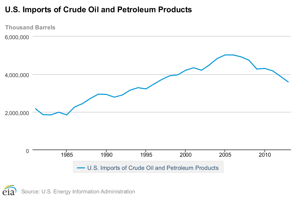
However, total imports have not followed exactly the same curve, and are substantially larger than net imports. 
Note: This graph depicts data in Barrels per YEAR.

There are several reasons for this. The biggest factors are:
  • Total imports minus exports equals net imports; the United States is one of the largest petroleum product exporters in the world, despite the fact that it routinely consumes more product than it produces.
  • Total imports have fallen in general, while exports have increased dramatically. 
  • US consumption of crude oil and petroleum products is presently at its lowest point since 1997/1998. Per capita oil consumption is at its lowest point in over 50 years.
  • Domestic oil stocks; an on-hand supply of oil and petroleum products that have already been produced and/or refined, but not yet sold/consumed.
  • Refining gains; simply put, is the reality that the refining process creates gains in volume from barrels of crude oil to barrels of refined product.
  • US oil companies sometimes import crude, refine it, and then export it or sell it domestically as a domestic product.

Note: This graph depicts data in Barrels per DAY.

US oil exploration & production has been swiftly ramped up in part due to President Obama's "All of the Above" energy strategy, and relentless political pressure by the oil & gas industry. "New" oil discoveries and "new" technologies have made it possible to slingshot the US into accelerated production.
(The word "new" is in quotation marks because the only thing that's truly new about these oil resources and extraction methods is that the political advantages and price of oil are finally high enough to warrant these types of operations).

US oil production is currently higher than it has been at any time since 1989. That's not bad. To some, it looks like the United States is finally on the road to self sufficiency.


Note: This graph depicts data in Barrels per DAY
.

The US has never produced more than 10 million barrels per day, while consumption has remained close to 19 million barrels per day for decades.

Note: This graph depicts data in Barrels per DAY.


Comparing US oil consumption to oil production data also reveals that one reason total imports & net imports have fallen is partly due to rising efficiency. However, consumption has also fallen because of high oil prices:


The above graph shows US oil production & consumption, represented by yellow & green bars, respectively. The blue line represents US oil consumption per capita. Data depicted in Barrels per DAY.


The gains in efficiency/conservation of oil consumption have been exemplary over the last 35 years. However, the main motive for increasing efficiency/conservation seems to be high oil prices. When the prices fall, consumption appears to rise slightly or stay stable. This next graph shows oil consumption per capita over the price per barrel (inflation adjusted):


All that is fairly obvious and basic economics. The bottom line looks very good on a dollar-for-dollar basis. While oil prices are fairly high, oil companies can continue to use these "new" techniques to open up these "vast" US oil resources that were previously unprofitable to extract. That opens the door to further innovations that may bring down the price of oil, right? Won't the US be able to produce more and more oil until it has no reason to import, thereby achieving "Energy Independence?" 

...Probably not. As implied earlier, the fact is that even at peak production in 1970, the US was still only producing about half as much oil as the country currently consumes each day. 


The thing is that the oil that US companies are drilling for right now is simply not as easy to get as it was in the 1970's. Once the US hit its peak, it took more and more oil rigs to locate discoveries & produce even fewer barrels of oil than the year before:

There are many other kinds of oil rigs in use in the US, but rotary rigs account for more than 80% of oil production.


The reason for this is decline rates- when wells are tapped, they produce huge volumes of oil for the first few years, then taper off to a fraction of their original production volume. When the decline rates fall past a certain "economic" limit, oil companies sell them to smaller companies or simply seal them off.

While prices remain high, politicians remain under intense pressure to open up private and public lands to new oil & gas operations. In order to achieve the same oil production that the US had in 1989, oil companies have three times as many oil rigs in operation searching for more profitable plays.


How much of its own oil would the US have to produce to be considered "Energy Independent?" Eighty percent? Ninety percent? One Hundred percent?

Given that the US has over 1,400 crude oil rotary rigs in operation today, and produces only about 48% of the oil it consumes, how many rigs would it need to achieve 100%? How many new plays must be discovered & how many new wells have to be tapped each year to sustain that rate?

That's why the situation is very much like that scene in "Through the Looking Glass." The US will have to run faster and faster each year just to stay in the same place.


UPDATE:
For reasons that are complex enough to deserve probably an entire mini-series of blog posts, the price of oil dropped substantially in recent months. The main result of this will be scaling back on exploration & discovery, fewer new off-shore and hydraulic fracturing projects across the board, and possibly closing down some of the less profitable operations by both small and large oil & gas companies. A bit down the road (depending on how long this all lasts) we may see some mergers & acquisitions among oil companies-- but we'll definitely be seeing some of the smaller/newer operations closing down or filing bankruptcy.

Few of us can accurately guess how long this oil price collapse will last, but it's likely to shape the way the world will produce oil for the next few years (at least) and will likely secure Saudi Arabia as the #1 oil exporter in the world-- putting the US back down to #2.

This type of market instability is disruptive to the economy as a whole and (in my personal opinion) is further evidence of the need to develop & deploy more alternative energy solutions!

For more info FAQ about Rotary Rigs and how these counts are performed, go to:
http://phx.corporate-ir.net/phoenix.zhtml?c=79687&p=irol-rigcountsfaqs